
Ten Years

Five Years

Xamarin Test Cloud
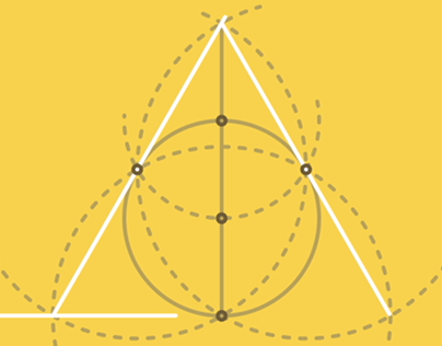
Geometric Construction

Brendan Rogan Reel Intro
Xamarin Evolve

To This Day Project

Full Secs - Father/Son Bonding